Actor input schema specification
Actor input schema is a JSON file which defines the schema and description of the input object and its properties accepted by the Actor on start. The file adheres to JSON schema with our extensions, and describes a single Actor input object and its properties, including documentation, default value, and user interface definition.
The Actor input schema file is used to:
- Validate the passed input JSON object on Actor run, so that Actors don't need to perform input validation and error handling in their code.
- Render user interface for Actors to make it easy for users to run and test them manually.
- Generate Actor API documentation and integration code examples on the web or in CLI, making Actors easy to integrate for users.
- Simplify integration of Actors into automation workflows such as Zapier or Make, by providing smart connectors that smartly pre-populate and link Actor input properties.
To define an input schema for an Actor, set input field in the .actor/actor.json file to an input schema object (described below), or path to a JSON file containing the input schema object.
For backwards compatibility, if the input field is omitted, the system looks for an INPUT_SCHEMA.json file either in the .actor directory or the Actor's top-level directory - but note that this functionality is deprecated and might be removed in the future. The maximum allowed size for the input schema file is 500 kB.
When you provide an input schema, the Apify platform will validate the input data passed to the Actor on start (via the API or Apify Console) to ensure compliance before starting the Actor. If the input object doesn't conform the schema, the caller receives an error and the Actor is not started.
You can use our visual input schema editor to guide you through the creation of the INPUT_SCHEMA.json file.
To ensure the input schema is valid, here's a corresponding JSON schema file.
You can also use the apify validate-schema command in the Apify CLI.
Example
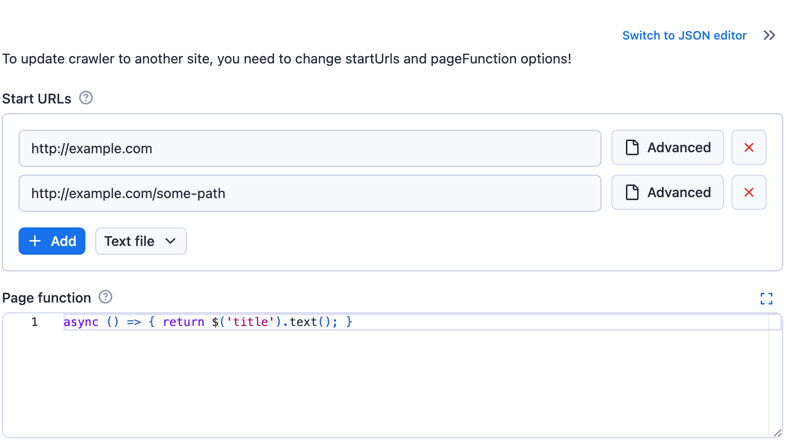
Imagine a simple web crawler that accepts an array of start URLs and a JavaScript function to execute on each visited page. The input schema for such a crawler could be defined as follows:
{
    "title": "Cheerio Crawler input",
    "description": "To update crawler to another site, you need to change startUrls and pageFunction options!",
    "type": "object",
    "schemaVersion": 1,
    "properties": {
        "startUrls": {
            "title": "Start URLs",
            "type": "array",
            "description": "URLs to start with",
            "prefill": [
                { "url": "http://example.com" },
                { "url": "http://example.com/some-path" }
            ],
            "editor": "requestListSources"
        },
        "pageFunction": {
            "title": "Page function",
            "type": "string",
            "description": "Function executed for each request",
            "prefill": "async () => { return $('title').text(); }",
            "editor": "javascript"
        }
    },
    "required": ["startUrls", "pageFunction"]
}
The generated input UI will be:
If you switch the input to the JSON display using the toggle, then you will see the entered input stringified to JSON, as it will be passed to the Actor:
{
    "startUrls": [
    {
        "url": "http://example.com"
    },
    {
        "url": "http://example.com/some-path"
    }
    ],
    "pageFunction": "async () => { return $('title').text(); }"
}
Structure
{
    "title": "Cheerio Crawler input",
    "type": "object",
    "schemaVersion": 1,
    "properties": { /* define input fields here */ },
    "required": []
}
| Property | Type | Required | Description |
|---|---|---|---|
title | String | Yes | Any text describing your input schema. |
description | String | No | Help text for the input that will be displayed above the UI fields. |
type | String | Yes | This is fixed and must be set to string object. |
schemaVersion | Integer | Yes | The version of the input schema specification against which your schema is written. Currently, only version 1 is out. |
properties | Object | Yes | This is an object mapping each field key to its specification. |
required | String | No | An array of field keys that are required. |
additionalProperties | Boolean | No | Controls if properties not listed in properties are allowed. Defaults to true. Set to false to make requests with extra properties fail. |
Even though the structure of the Actor input schema is similar to JSON schema, there are some differences. We cannot guarantee that JSON schema tooling will work on input schema documents. For a more precise technical understanding of the matter, feel free to browse the code of the @apify/input_schema package.
Input fields
Each field of your input is described under its key in the inputSchema.properties object. The field might have integer, string, array, object, or boolean type, and its specification contains the following properties:
| Property | Value | Required | Description |
|---|---|---|---|
type | One of
| Yes | Allowed type for the input value. Cannot be mixed. |
title | String | Yes | Title of the field in UI. |
description | String | Yes | Description of the field that will be displayed as help text in Actor input UI. |
default | Must match type property. | No | Default value that will be used when no value is provided. |
prefill | Must match type property. | No | Value that will be prefilled in the Actor input interface. |
example | Must match type property. | No | Sample value of this field for the Actor to be displayed when Actor is published in Apify Store. |
errorMessage | Object | No | Custom error messages for validation keywords. See custom error messages for more details. |
sectionCaption | String | No | If this property is set, then all fields following this field (this field included) will be separated into a collapsible section with the value set as its caption. The section ends at the last field or the next field which has the sectionCaption property set. |
sectionDescription | String | No | If the sectionCaption property is set, then you can use this property to provide additional description to the section. The description will be visible right under the caption when the section is open. |
Prefill vs. default vs. required
Here is a rule of thumb for whether an input field should have a prefill, default, or be required:
- Prefill - Use for fields that don't have a reasonable default. The provided value is prefilled for the user to show them an example of using the field and to make it easy to test the Actor (e.g., search keyword, start URLs). In other words, this field is only used in the user interface but does not affect the Actor functionality and API. Note that if you add a new input option to your Actor, the Prefill value won't be used by existing integrations such as Actor tasks or API calls, but the Default will be if specified. This is useful for keeping backward compatibility when introducing a new flag or feature that you prefer new users to use.
- Required - Use for fields that don't have a reasonable default and MUST be entered by the user (e.g., API token, password).
- Default - Use for fields that MUST be set for the Actor run to some value, but where you don't need the user to change the default behavior (e.g., max pages to crawl, proxy settings). If the user omits the value when starting the Actor via any means (API, CLI, scheduler, or user interface), the platform automatically passes the Actor this default value.
- No particular setting - Use for purely optional fields where it makes no sense to prefill any value (e.g., flags like debug mode or download files).
In summary, you can use each option independently or use a combination of Prefill + Required or Prefill + Default, but the combination of Default + Required doesn't make sense to use.
Input types
Most types also support additional properties defining, for example, the UI input editor.
String
String is the most common input field type, and provide a number of editors and validations properties:
| Property | Value | Required | Description |
|---|---|---|---|
editor | One of: - textfield- textarea- javascript- python- select- datepicker- fileupload- hidden | Yes | Visual editor used for the input field. |
pattern | String | No | Regular expression that will be used to validate the input. If validation fails, the Actor will not run. |
minLength | Integer | No | Minimum length of the string. |
maxLength | Integer | No | Maximum length of the string. |
enum | [String] | Required if editor is select | Using this field, you can limit values to the given array of strings. Input will be displayed as select box. Values are strictly validated against this list. |
enumSuggestedValues | [String] | No | Similar to enum, but only suggests values in the UI without enforcing validation. Users can select from the dropdown or enter custom value.Works only with the select editor. |
enumTitles | [String] | No | Displayed titles for the enum or enumSuggestedValues properties. |
nullable | Boolean | No | Specifies whether null is an allowed value. |
isSecret | Boolean | No | Specifies whether the input field will be stored encrypted. Only available with textfield, textarea and hidden editors. |
dateType | One of
| No | This property, which is only available with datepicker editor, specifies what date format should visual editor accept (The JSON editor accepts any string without validation.).
Defaults to absolute. |
When using escape characters \ for the regular expression in the pattern field, be sure to escape them to avoid invalid JSON issues. For example, the regular expression https:\/\/(www\.)?apify\.com\/.+ would become https:\\/\\/(www\\.)?apify\\.com\\/.+.
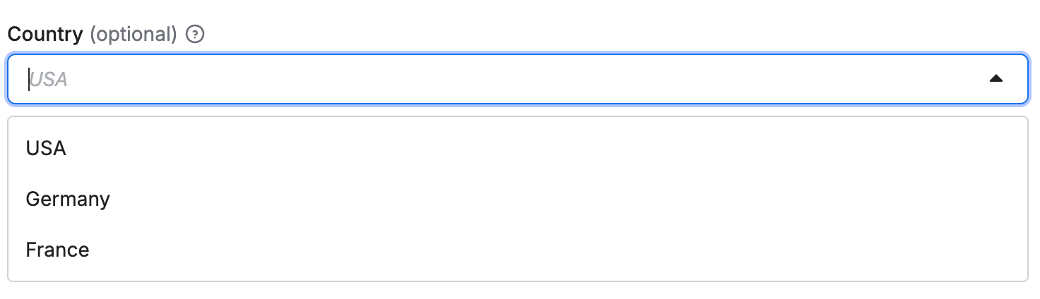
Select editor for strings
The select editor for strings allows users to choose a value from a dropdown list.
You can either only allow users to select from a set of predefined values, or allow them to specify custom values in addition to suggested values.
Select from predefined values
When you need to restrict input to a specific set of values, use the enum property:
{
    "title": "Country",
    "type": "string",
    "description": "Select your country",
    "editor": "select",
    "default": "us",
    "enum": ["us", "de", "fr"],
    "enumTitles": ["USA", "Germany", "France"]
}
The select editor is rendered as drop-down in user interface:
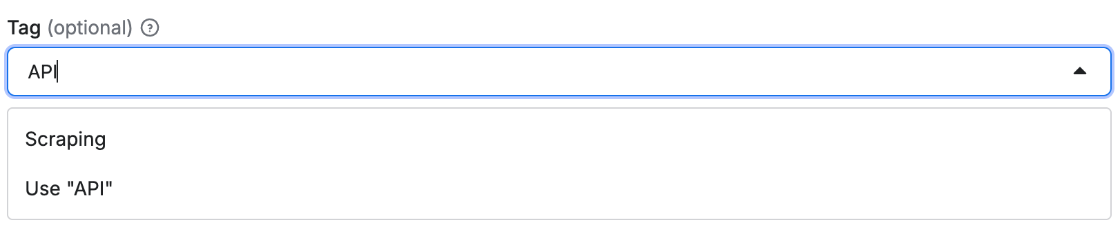
Select with custom input
When you want to suggest values but still allow custom input, use the enumSuggestedValues property:
{
    "title": "Tag",
    "type": "string",
    "description": "Select or enter a custom tag",
    "editor": "select",
    "default": "web",
    "enumSuggestedValues": ["web", "scraping", "automation"],
    "enumTitles": ["Web", "Scraping", "Automation"]
}
This creates a select dropdown with suggested values, but users can also enter custom values:
Code editor
If the input string is code, you can use either javascript or python editor
for syntax highlighting.
For example:
{
    "title": "Page function",
    "type": "string",
    "description": "Function executed for each request",
    "editor": "javascript",
    "prefill": "async () => { return $('title').text(); }"
}
Rendered input:

Date picker
Example of date selection using absolute and relative datepicker editor:
{
    "absoluteDate": {
        "title": "Date",
        "type": "string",
        "description": "Select absolute date in format YYYY-MM-DD",
        "editor": "datepicker",
        "pattern": "^(\\d{4})-(0[1-9]|1[0-2])-(0[1-9]|[12]\\d|3[01])$"
    },
    "relativeDate": {
        "title": "Relative date",
        "type": "string",
        "description": "Select relative date in format: {number} {unit}",
        "editor": "datepicker",
        "dateType": "relative",
        "pattern": "^(\\d+)\\s*(day|week|month|year)s?$"
    },
    "anyDate": {
        "title": "Any date",
        "type": "string",
        "description": "Select date in format YYYY-MM-DD or {number} {unit}",
        "editor": "datepicker",
        "dateType": "absoluteOrRelative",
        "pattern": "^(\\d{4})-(0[1-9]|1[0-2])-(0[1-9]|[12]\\d|3[01])$|^(\\d+)\\s*(day|week|month|year)s?$"
    }
}
The absoluteDate property renders a date picker that allows selection of a specific date and returns string value in YYYY-MM-DD format. Validation is ensured thanks to pattern field. In this case the dateType property is omitted, as it defaults to "absolute".
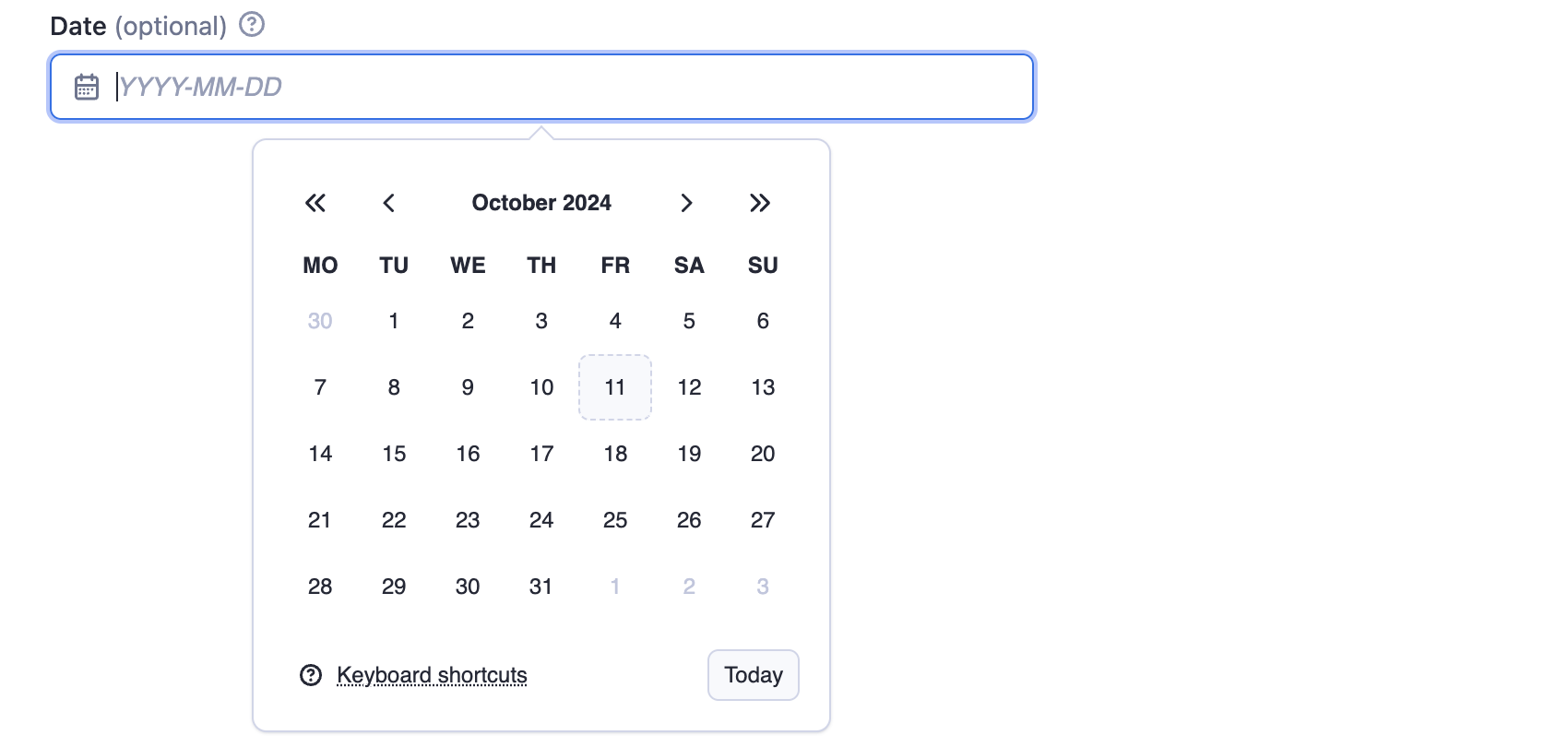
The relativeDate property renders an input field that enables the user to choose the relative date and returns the value in {number} {unit} format, for example "2 days". The dateType parameter is set to "relative" to restrict input to relative dates only.

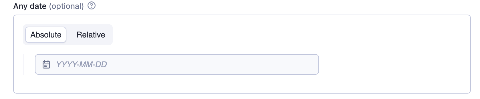
The anyDate property renders a date picker that accepts both absolute and relative dates. The Actor author is responsible for parsing and interpreting the selected date format.
Advanced date and time handling
While the datepicker editor doesn't support setting time values visually, you can allow users to handle more complex datetime formats and pass them via JSON. The following regex allows users to optionally extend the date with full ISO datetime format or pass hours and minutes as a relative date:
"pattern": "^(\\d{4})-(0[1-9]|1[0-2])-(0[1-9]|[12]\\d|3[01])(T[0-2]\\d:[0-5]\\d(:[0-5]\\d)?(\\.\\d+)?Z?)?$|^(\\d+)\\s*(minute|hour|day|week|month|year)s?$"
When implementing time-based fields, make sure to explain to your users through the description that the time values should be provided in UTC. This helps prevent timezone-related issues.
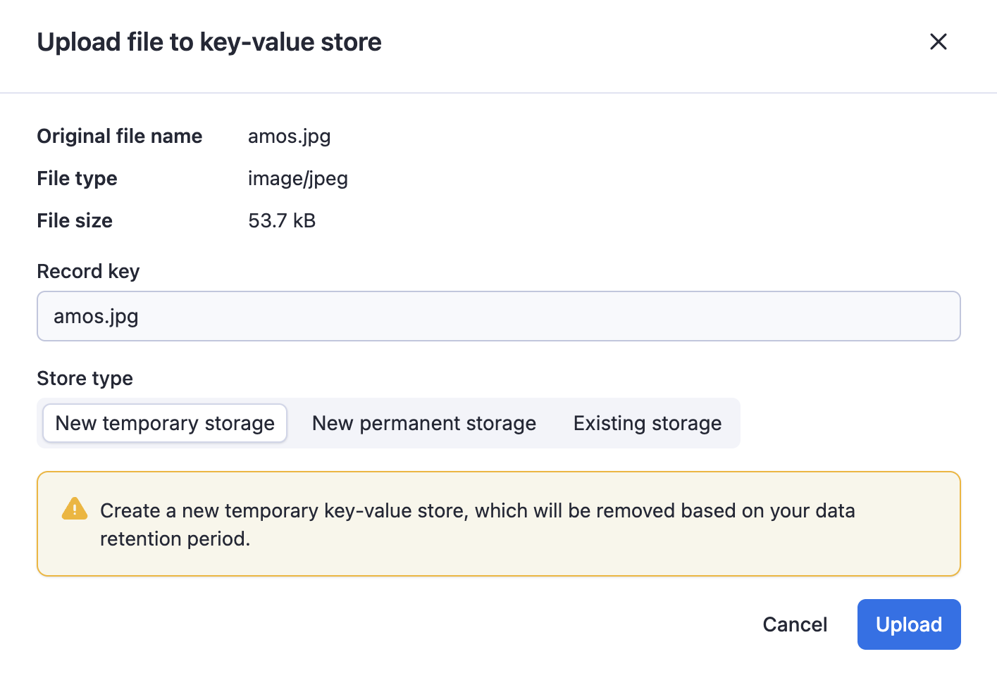
File upload
The fileupload editor enables users to specify a file as input. The input is passed to the Actor as a string. It is the Actor author's responsibility to interpret this string, including validating its existence and format.
The editor makes it easier to users to upload the file to a key-value store of their choice.
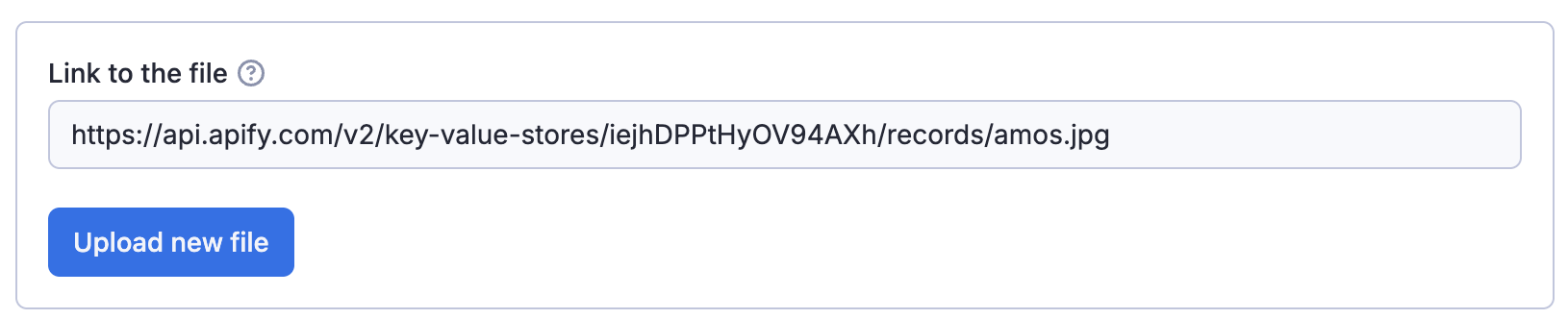
The user provides either a URL or uploads the file to a key-value store (existing or new).
Boolean type
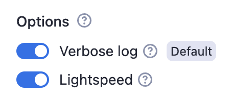
Example options with group caption:
{
    "verboseLog": {
        "title": "Verbose log",
        "type": "boolean",
        "description": "Debug messages will be included in the log.",
        "default": true,
        "groupCaption": "Options",
        "groupDescription": "Various options for this Actor"
    },
    "lightspeed": {
        "title": "Lightspeed",
        "type": "boolean",
        "description": "If checked then actors runs at the
            speed of light.",
        "prefill": true
    }
}
Rendered input:
Properties:
| Property | Value | Required | Description |
|---|---|---|---|
editor | One of
| No | Visual editor used for the input field. |
groupCaption | String | No | If you want to group multiple checkboxes together, add this option to the first of the group. |
groupDescription | String | No | Description displayed as help text displayed of group title. |
nullable | Boolean | No | Specifies whether null is an allowed value. |
Numeric types
There are two numeric types supported in the input schema: integer and number.
- The
integertype represents whole numbers. - The
numbertype can represent both integers and floating-point numbers.
Example:
{
    "title": "Memory",
    "type": "integer",
    "description": "Select memory in megabytes",
    "default": 64,
    "maximum": 1024,
    "unit": "MB"
}
Rendered input:

Properties:
| Property | Value | Required | Description |
|---|---|---|---|
type | One of
| Yes | Defines the type of the field - either an integer or a floating-point number. |
editor | One of:
| No | Visual editor used for input field. |
maximum | Integer or Number (based on the type) | No | Maximum allowed value. |
minimum | Integer or Number (based on the type) | No | Minimum allowed value. |
unit | String | No | Unit displayed next to the field in UI, for example second, MB, etc. |
nullable | Boolean | No | Specifies whether null is an allowed value. |
Object type
Example of proxy configuration:
{
    "title": "Proxy configuration",
    "type": "object",
    "description": "Select proxies to be used by your crawler.",
    "prefill": { "useApifyProxy": true },
    "editor": "proxy"
}
Rendered input:
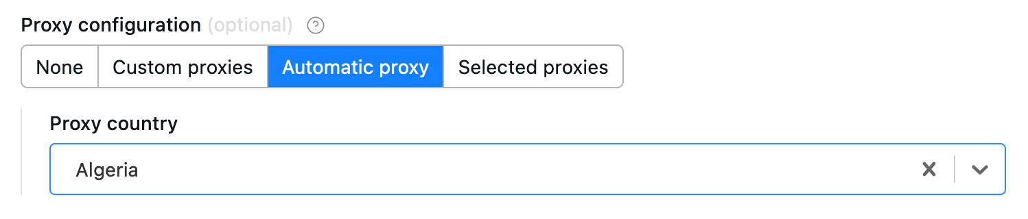
The object where the proxy configuration is stored has the following structure:
{
    // Indicates whether Apify Proxy was selected.
    "useApifyProxy": Boolean,

    // Array of Apify Proxy groups. Is missing or null if
    // Apify Proxy's automatic mode was selected
    // or if proxies are not used.
    "apifyProxyGroups": String[],

    // Array of custom proxy URLs.
    // Is missing or null if custom proxies were not used.
    "proxyUrls": String[],
}
Example of a black box object:
{
    "title": "User object",
    "type": "object",
    "description": "Enter object representing user",
    "prefill": {
        "name": "John Doe",
        "email": "janedoe@gmail.com"
    },
    "editor": "json"
}
Rendered input:

Properties:
| Property | Value | Required | Description |
|---|---|---|---|
editor | One of
| Yes | UI editor used for input. |
maxProperties | Integer | No | Maximum number of properties the object can have. |
minProperties | Integer | No | Minimum number of properties the object can have. |
nullable | Boolean | No | Specifies whether null is an allowed value. |
isSecret | Boolean | No | Specifies whether the input field will be stored encrypted. Only available with json and hidden editors. |
properties | Object | No | Defines the sub-schema properties for the object used for validation and UI rendering (schemaBased editor). See more info below. |
additionalProperties | Boolean | No | Controls if sub-properties not listed in properties are allowed. Defaults to true. Set to false to make requests with extra properties fail. |
required | String array | No | An array of sub-properties keys that are required. Note: This applies only if the object field itself is present. If the object field is optional and not included in the input, its required subfields are not validated. |
patternKey | String | No | Deprecated (see migration information). Regular expression that will be used to validate the keys of the object. |
patternValue | String | No | Deprecated (see migration information). Regular expression that will be used to validate the values of object. |
Object fields validation
Like root-level input schemas, you can define a schema for sub-properties of an object using the properties field.
Each sub-property within this sub-schema can define the same fields as those available at the root level of the input schema, except for the fields that apply only at the root level: sectionCaption and sectionDescription.
Validation is performed both in the UI and during Actor execution via the API. Sub-schema validation works independently of the editor selected for the parent object. It also respects the additionalProperties and required fields, giving you precise control over whether properties not defined in properties are permitted and which properties are mandatory.
Object sub-properties can define their own sub-schemas recursively with no nesting depth limit.
{
    "title": "Configuration",
    "type": "object",
    "description": "Advanced configuration options",
    "editor": "json",
    "properties": {
        "locale": {
            "title": "Locale",
            "type": "string",
            "description": "Locale identifier.",
            "pattern": "^[a-z]{2,3}-[A-Z]{2}$"
        },
        "timeout": {
            "title": "Timeout",
            "type": "integer",
            "description": "Request timeout in seconds",
            "minimum": 1,
            "maximum": 300
        },
        "debugMode": {
            "title": "Debug Mode",
            "type": "boolean",
            "description": "Enable verbose logging during scraping"
        }
    },
    "required": ["locale", "timeout"],
    "additionalProperties": false
}
Rendered input:
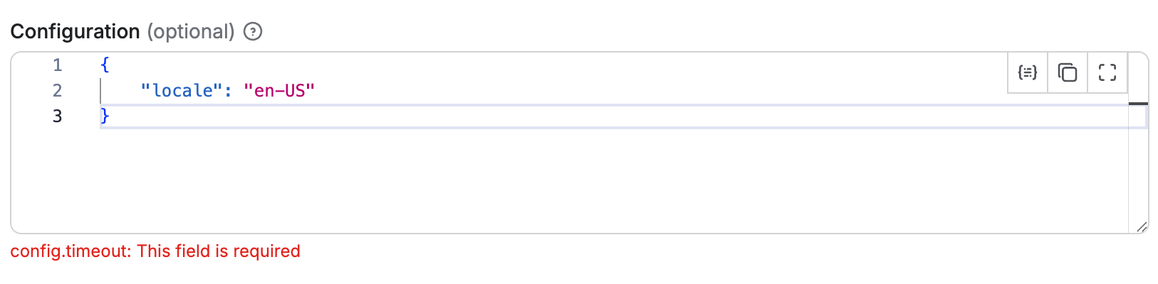
In this example, the object has validation rules for its properties:
- The
timeoutproperty must be an integer between 1 and 300 - The
localeproperty must be a string matching the pattern^[a-z]{2,3}-[A-Z]{2}$ - The
debugModeproperty is optional and can be eithertrueorfalse - The
timeoutandlocaleproperties are required - No additional properties beyond those defined are allowed
Handling default and prefill values for object sub-properties
When defining object with sub-properties, it's possible to set default and prefill values in two ways:
- At the parent object level: You can provide a complete object as the
defaultorprefillvalue, which will set values for all sub-properties at once. - At the individual sub-property level: You can specify
defaultorprefillvalues for each sub-property separately within thepropertiesdefinition.
When both methods are used, the values defined at the parent object level take precedence over those defined at the sub-property level. For example, in the input schema like this:
{
    "title": "Configuration",
    "type": "object",
    "description": "Advanced configuration options",
    "editor": "schemaBased",
    "default": {
        "timeout": 60
    },
    "properties": {
        "locale": {
            "title": "Locale",
            "type": "string",
            "description": "Locale identifier.",
            "pattern": "^[a-z]{2,3}-[A-Z]{2}$",
            "editor": "textfield",
            "default": "en-US"
        },
        "timeout": {
            "title": "Timeout",
            "type": "integer",
            "description": "Request timeout in seconds",
            "minimum": 1,
            "maximum": 300,
            "editor": "number",
            "default": 120
        }
    }
}
The timeout sub-property will have a default value of 60 (from the parent object), while the locale sub-property will have a default value of "en-US" (from its own definition).
Schema-based editor
Object with sub-schema defined can use the schemaBased editor, which provides a user-friendly interface for editing each property individually.
It renders all properties based on their type (and editor field), providing a user-friendly interface for complex objects.
This feature works for objects (and arrays of objects), enabling each property to have its own input field in the UI.
Objects with a defined sub-schema can use the schemaBased editor, which provides a user-friendly interface for editing each property individually.
It renders all properties based on their type (and optionally the editor field), making it ideal for visually managing complex object structures.
This editor supports both single objects and arrays of objects (see below), allowing each property to be represented with an appropriate input field in the UI.
{
    "title": "Configuration",
    "type": "object",
    "description": "Advanced configuration options",
    "editor": "schemaBased",
    "properties": {
        "locale": {
            "title": "Locale",
            "type": "string",
            "description": "Locale identifier.",
            "pattern": "^[a-z]{2,3}-[A-Z]{2}$",
            "editor": "textfield"
        },
        "timeout": {
            "title": "Timeout",
            "type": "integer",
            "description": "Request timeout in seconds",
            "minimum": 1,
            "maximum": 300,
            "editor": "number"
        },
        "debugMode": {
            "title": "Debug Mode",
            "type": "boolean",
            "description": "Enable verbose logging during scraping",
            "editor": "checkbox"
        }
    },
    "required": ["locale", "timeout"],
    "additionalProperties": false
}
Rendered input:
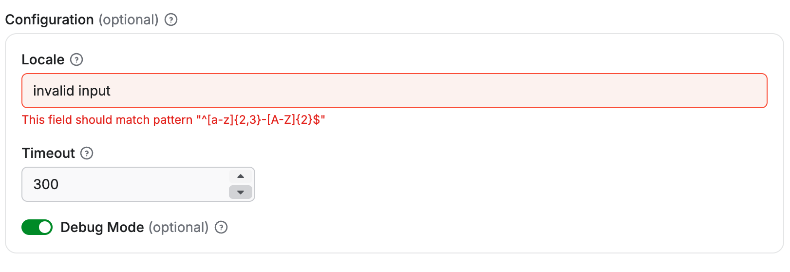
Each sub-property is rendered with its own input field according to its type and editor configuration:
- The
localeproperty is rendered as a text field. - The
timeoutproperty is rendered as a numeric input with validation limits. - The
debugModeproperty is rendered as a checkbox toggle.
Limitations
The schemaBased editor supports only top-level sub-properties (level 1 nesting).
While deeper nested properties can still define sub-schemas for validation, they cannot use the schemaBased editor for rendering.
For example, if the Configuration object above included a property that was itself an object with its own sub-properties, those deeper levels would need to use a different editor, such as json.
Array
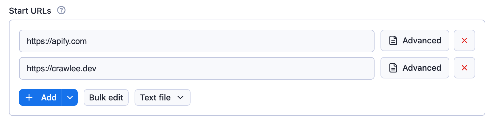
Example of request list sources configuration:
{
    "title": "Start URLs",
    "type": "array",
    "description": "URLs to start with",
    "prefill": [{ "url": "https://apify.com" }],
    "editor": "requestListSources"
}
Rendered input:
Example of an array:
{
    "title": "Colors",
    "type": "array",
    "description": "Enter colors you know",
    "prefill": ["Red", "White"],
    "editor": "json"
}
Rendered input:

Properties:
| Property | Value | Required | Description |
|---|---|---|---|
editor | One of
| Yes | UI editor used for input. |
placeholderKey | String | No | Placeholder displayed for key field when no value is specified. Works only with keyValue editor. |
placeholderValue | String | No | Placeholder displayed in value field when no value is provided. Works only with keyValue and stringList editors. |
maxItems | Integer | No | Maximum number of items the array can contain. |
minItems | Integer | No | Minimum number of items the array can contain. |
uniqueItems | Boolean | No | Specifies whether the array should contain only unique values. |
nullable | Boolean | No | Specifies whether null is an allowed value. |
items | object | No | Specifies format of the items of the array, useful mainly for multiselect and for schemaBased editor (see below). |
isSecret | Boolean | No | Specifies whether the input field will be stored encrypted. Only available with json and hidden editors. |
patternKey | String | No | Deprecated (see migration information). Regular expression that will be used to validate the keys of items in the array. Works only with keyValue editor. |
patternValue | String | No | Deprecated (see migration information). Regular expression that will be used to validate the values of items in the array. Works only with keyValue and stringList editors. |
Usage of this field is based on the selected editor:
requestListSources- value from this field can be used as input for the RequestList class from Crawlee.pseudoUrls- is intended to be used with a combination of the PseudoUrl class and the enqueueLinks() function from Crawlee.
Editor type requestListSources supports input in formats defined by the sources property of RequestListOptions.
Editor type globs maps to the Crawlee's GlobInput used by the UrlPatterObject.
Editor type fileupload enables users to specify a list of files as input. The input is passed to the Actor as an array of strings. The Actor author is responsible for interpreting the strings, including validating file existence and format. This editor simplifies the process for users to upload files to a key-value store of their choice.
Select editor for arrays
The select editor for arrays allows users to pick multiple items from a dropdown list. This creates a multiselect field in the UI.
You can either only allow users to select from a set of predefined values, or allow them to specify custom values in addition to suggested values.
To correctly define options for multiselect, you need to define the items property and then provide values in enum/enumSuggestedValues and (optionally) labels in enumTitles properties.
Select from predefined values
When you need to restrict selections to a specific set of values, use the enum property:
{
    "title": "Countries",
    "description": "Select multiple countries",
    "type": "array",
    "editor": "select",
    "items": {
        "type": "string",
        "enum": ["us", "de", "fr", "uk", "jp"],
        "enumTitles": ["United States", "Germany", "France", "United Kingdom", "Japan"]
    }
}
This creates a multiselect dropdown where users can only select from the predefined values:

Select with custom input
When you want to suggest values but still allow custom input, use the enumSuggestedValues property:
{
    "title": "Tags",
    "description": "Select or enter custom tags",
    "type": "array",
    "editor": "select",
    "items": {
        "type": "string",
        "enumSuggestedValues": ["web", "scraping", "automation", "data", "api"],
        "enumTitles": ["Web", "Scraping", "Automation", "Data", "API"]
    }
}
This creates a multiselect dropdown with suggested values, but users can also enter custom values:

Array items validation
Arrays in the input schema can define an items field to specify the type and validation rules for each item.
Each array item is validated according to its type and inside the items field it's also possible to define additional validation rules such as pattern, minimum, maximum, etc., depending on the item type.
If the item type is an object, it can define its own properties, required, and additionalProperties fields,
working in the same way as a single object field (see Object fields validation).
Validation is performed both in the UI and during Actor execution via the API. Array items can themselves be objects with sub-schemas, and objects within objects, recursively, without any limit on nesting depth.
{
    "title": "Request Headers",
    "type": "array",
    "description": "List of custom HTTP headers",
    "editor": "json",
    "items": {
        "type": "object",
        "properties": {
            "name": {
                "title": "Header Name",
                "description": "Name of the HTTP header",
                "type": "string",
                "minLength": 1
            },
            "value": {
                "title": "Header Value",
                "description": "Value of the HTTP header",
                "type": "string",
                "minLength": 1
            }
        },
        "required": ["name", "value"],
        "additionalProperties": false
    },
    "minItems": 1,
    "maxItems": 20
}
Rendered input:
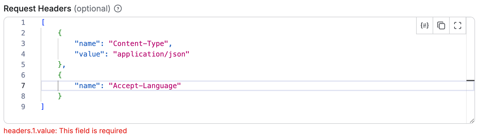
In this example:
- The array must contain between 1 and 20 items.
- Each item must be an object with
nameandvalueproperties. - Both
nameandvalueare required. - No additional properties beyond those defined are allowed.
- The validation of each object item works the same as for a single object field (see Object fields validation).
Handling default and prefill values array with object sub-properties
When defining an array of objects with sub-properties, it's possible to set default and prefill values in two ways:
- At the parent array level: You can provide an array of complete objects as the
defaultorprefillvalue, which will be used only if there is no value specified for the field. - At the individual sub-property level: You can specify
defaultorprefillvalues for each sub-property within thepropertiesdefinition of the object items. These values will be applied to each object in the array value.
For example, having an input schema like this:
{
    "title": "Requests",
    "type": "array",
    "description": "List of HTTP requests",
    "editor": "schemaBased",
    "default": [
        { "url": "https://apify.com", "port": 80 }
    ],
    "items": {
        "type": "object",
        "properties": {
            "url": {
                "title": "URL",
                "type": "string",
                "description": "Request URL",
                "editor": "textfield"
            },
            "port": {
                "title": "Port",
                "type": "integer",
                "description": "Request port",
                "editor": "number",
                "default": 8080
            }
        },
        "required": ["url", "port"],
        "additionalProperties": false
    }
}
If there is no value specified for the field, the array will default to containing one object:
[
    { "url": "https://apify.com", "port": 80 }
]
However, if the user adds a new item to the array, the port sub-property of that new object will default to 8080, as defined in the sub-property itself.
schemaBased editor
Arrays can use the schemaBased editor to provide a user-friendly interface for editing each item individually.
It works for arrays of primitive types (like strings or numbers) as well as arrays of objects, rendering each item according to its type and optional editor configuration.
This makes it easy to manage complex arrays in the UI while still enforcing validation rules defined in the items field.
{
    "title": "Start URLs",
    "type": "array",
    "description": "List of URLs for the scraper to visit",
    "editor": "schemaBased",
    "items": {
        "type": "string",
        "pattern": "^https?:\\/\\/(?:[a-zA-Z0-9-]+\\.)+[a-zA-Z]{2,}(?:\\/\\S*)?$"
    },
    "minItems": 1,
    "maxItems": 50,
    "uniqueItems": true
}
Rendered input:
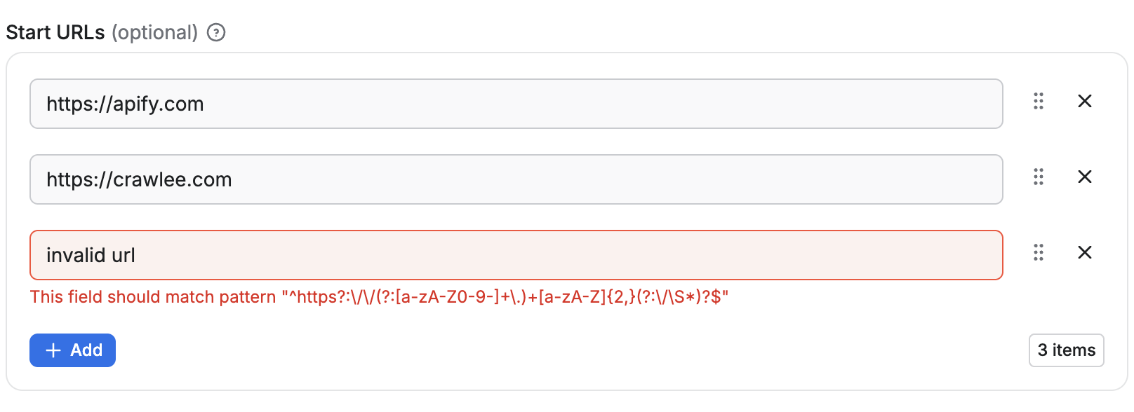
- Each item is rendered as a text field.
- The array must contain between 1 and 50 items.
- Duplicate values are not allowed.
{
    "title": "Request Headers",
    "type": "array",
    "description": "List of custom HTTP headers",
    "editor": "schemaBased",
    "items": {
        "type": "object",
        "properties": {
            "name": {
                "title": "Header Name",
                "description": "Name of the HTTP header",
                "type": "string",
                "minLength": 1,
                "editor": "textfield"
            },
            "value": {
                "title": "Header Value",
                "description": "Value of the HTTP header",
                "type": "string",
                "minLength": 1,
                "editor": "textfield"
            }
        },
        "required": ["name", "value"],
        "additionalProperties": false
    },
    "minItems": 1,
    "maxItems": 20
}
Rendered input:
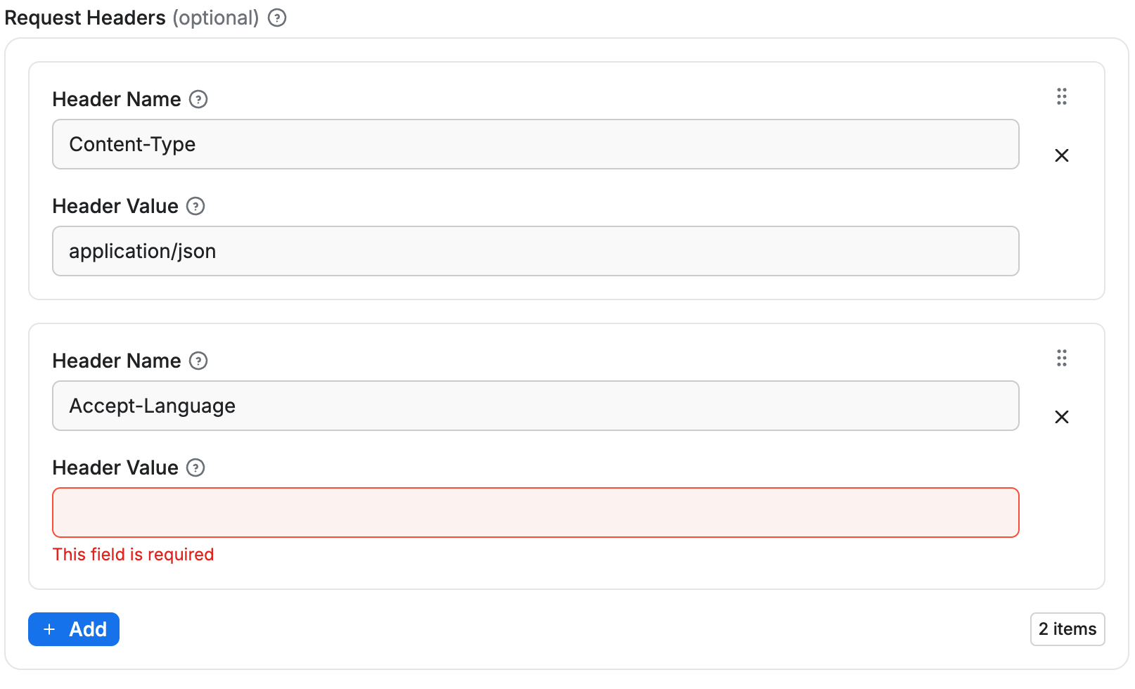
- Each array item is represented as a group of input fields (
nameandvalue). - Validation ensures all required sub-properties are filled and no extra properties are allowed.
- New items can be added up to the
maxItemslimit, and each item is validated individually.
Limitations
As with objects, the sub-schema feature for arrays only works for level 1 sub-properties. While the objects in the array can have properties with their own schema definitions, those properties cannot themselves use the schemaBased editor.
Resource type
Resource type identifies what kind of Apify Platform object is referred to in the input field. For example, the Key-value store resource type can be referred to using a string ID.
Supported resource types are storage resources (dataset, key-value store, request queue) and MCP connectors, which let an Actor call third-party MCP servers using credentials the user has authorized in their account.
For Actor developers, the resource input value is a string representing either the resource ID or (unique) name.
The type of the property is either string or array. In case of array (for multiple resources) the return value is an array of IDs or names.
In the user interface, a picker (resourcePicker editor) is provided for easy selection, where users can search and choose from their own resources or those they have access to.
Example of a Dataset input:
{
    "title": "Dataset",
    "type": "string",
    "description": "Select a dataset",
    "resourceType": "dataset"
}
Rendered input:
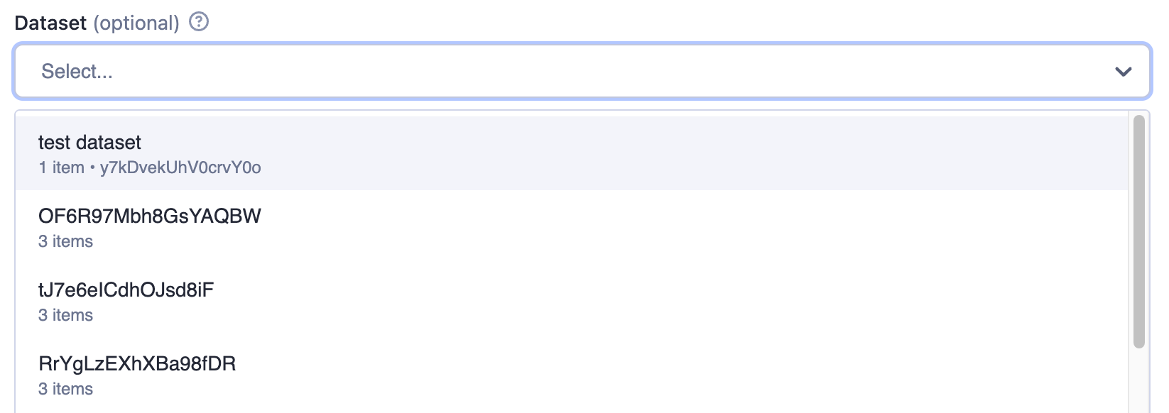
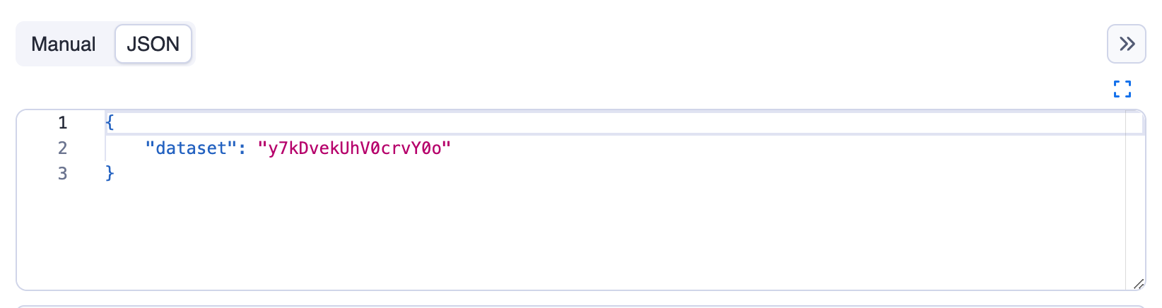
The returned value is resource reference, in this example it's the dataset ID as can be seen in the JSON tab:
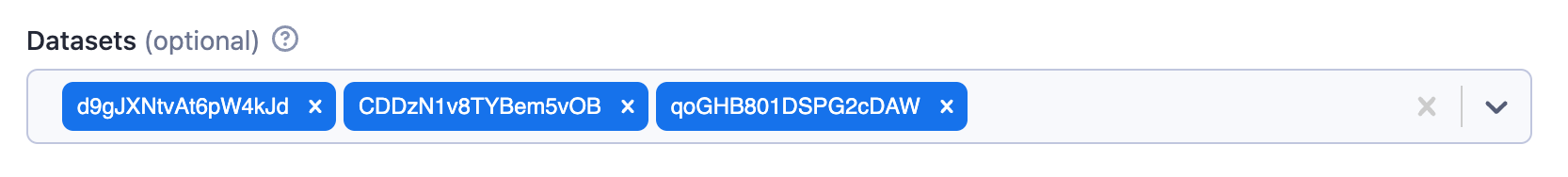
Example of multiple datasets input:
{
    "title": "Datasets",
    "type": "array",
    "description": "Select multiple datasets",
    "resourceType": "dataset",
    "resourcePermissions": ["READ"]
}
Rendered input:
Single value properties
| Property | Value | Required | Description |
|---|---|---|---|
type | string | Yes | Specifies the type of input - string for single value. |
editor | One of
| No | Visual editor used for the input field. Defaults to resourcePicker. |
resourceType | One of
| Yes | Type of Apify Platform resource. Use mcpConnector to accept an MCP connector as input. |
resourcePermissions | Array of strings; allowed values:
| Yes for storage resources; not used for mcpConnector | Permissions requested for the referenced resource. Use ["READ"] for read-only access, or ["READ", "WRITE"] to allow writes. |
pattern | String | No | Regular expression that will be used to validate the input. If validation fails, the Actor will not run. |
minLength | Integer | No | Minimum length of the string. |
maxLength | Integer | No | Maximum length of the string. |
Multiple values properties
| Property | Value | Required | Description |
|---|---|---|---|
type | array | Yes | Specifies the type of input - array for multiple values. |
editor | One of
| No | Visual editor used for the input field. Defaults to resourcePicker. |
resourceType | One of
| Yes | Type of Apify Platform resource. Use mcpConnector to accept MCP connectors as input. |
resourcePermissions | Array of strings; allowed values:
| Yes for storage resources; not used for mcpConnector | Permissions requested for the referenced resources. Use ["READ"] for read-only access, or ["READ", "WRITE"] to allow writes. Applies to each selected resource. |
minItems | Integer | No | Minimum number of items the array can contain. |
maxItems | Integer | No | Maximum number of items the array can contain. |
Resource permissions
If your Actor runs with limited permissions, it must declare what access it needs to resources supplied via input. The resourcePermissions field defines which operations your Actor can perform on user-selected storages. This field is evaluated at run start and expands the Actor's limited permissions scope to access resources sent via input.
["READ"]- The Actor can read from the referenced resources.["READ", "WRITE"]- The Actor can read from and write to the referenced resources.
This setting defines runtime access only and doesn't change field visibility or whether the field is required in the UI. For array fields (type: array), the same permissions apply to each selected resource. Your Actor's run will fail with an insufficient-permissions error if it attempts an operation without the required permission, such as writing with read-only access. Users can see the required permissions in the input field's tooltip.
MCP connector resource type
When resourceType is mcpConnector, the input field accepts one or more MCP connectors the user has authorized in their account. The Actor receives the connector ID (or an array of IDs) as the input value and connects to the upstream MCP server through the Apify MCP Proxy at runtime.
The mcpConnector resource type does not use resourcePermissions. Instead, eligibility and per-tool access are declared through a required mcpServers field, which lists the upstream MCP server URLs and tool constraints the Actor accepts:
{
    "slackConnector": {
        "title": "Slack connector",
        "description": "Read-only access to your Slack workspace",
        "type": "string",
        "resourceType": "mcpConnector",
        "mcpServers": [
            {
                "url": "https://mcp.slack.com/mcp",
                "tools": {
                    "required": ["list_*", "get_*", "read_*"],
                    "readOnly": true
                }
            }
        ]
    }
}
The same declaration acts as both eligibility filter (the input picker only offers compatible connectors) and runtime ceiling (the proxy rejects tool calls outside the declared set). For the full mcpServers schema, behavioral hints, and code samples, see Build Actors with MCP connectors.
Deprecation of patternKey and patternValue
The following properties are deprecated and will only be supported until June 30, 2026:
patternKey- Used to validate keys in objects and arrayspatternValue- Used to validate values in objects and arrays
These properties are being deprecated to better align with the JSON schema specification. By moving to standard JSON schema, a more consistent experience is provided that matches industry standards while enabling more powerful validation capabilities through the ability to define sub-properties.
Alternatives for arrays
For arrays, you can replace patternKey and patternValue by using the items property with a subschema.
Example of replacing patternValue for an array of strings:
{
    "title": "Tags",
    "type": "array",
    "description": "Enter tags",
    "editor": "stringList",
    "patternValue": "^[a-zA-Z0-9-_]+$"
}
{
    "title": "Tags",
    "type": "array",
    "description": "Enter tags",
    "editor": "stringList",
    "items": {
        "type": "string",
        "pattern": "^[a-zA-Z0-9-_]+$"
    }
}
Example of replacing both patternKey and patternValue for an array with key-value pairs:
{
    "title": "Headers",
    "type": "array",
    "description": "HTTP headers",
    "editor": "keyValue",
    "patternKey": "^[a-zA-Z0-9-]+$",
    "patternValue": "^.+$"
}
{
    "title": "Headers",
    "type": "array",
    "description": "HTTP headers",
    "editor": "keyValue",
    "items": {
        "type": "object",
        "properties": {
            "key": {
                "title": "Name",
                "type": "string",
                "description": "Header name",
                "pattern": "^[a-zA-Z0-9-]+$"
            },
            "value": {
                "title": "Value",
                "type": "string",
                "description": "Header value",
                "pattern": "^.+$"
            }
        },
        "required": ["key", "value"]
    }
}
Alternatives for objects
For objects, there is currently no direct replacement for patternKey and patternValue properties. These validation features will not be supported in future versions.
If you need to validate object properties, consider using a predefined schema with the properties field instead of allowing arbitrary properties with validation patterns.